


Imagine someone discovering your organization for the first time. They’ll likely search it online and find your website. If they choose to give, they’ll land on one of the most important pages of your nonprofit website: your online donation page. After all, this is the place where your supporters officially fill out your online donation form and submit a gift!
With online fundraising becoming an increasingly popular and convenient way to give, it’s worthwhile to look at your donation page and ensure you’re doing all you can to prioritize the online donor experience.
However, creating a donation page involves more than displaying or linking out to a donation form. From how the donation page is designed to how easy it is to find within your website, this page can either convert potential supporters into donors or drive them away.
To create the best donation page for your organization, you must streamline the online giving process and ensure you’re meeting supporters’ needs. But how exactly do you do that?
Here at iATS Payments by Deluxe®, we know the importance of your donation page and what it means for the growth of your organization. Explore our guide to learn what makes a donation so important, best practices you can implement to optimize it, and even examples of successful donation pages:
- Why is Your Online Donation Page So Important?
- 10 Ways You Can Optimize Your Donation Page
- Donation Page Examples
Let’s dive in.


Why is Your Online Donation Page So Important?
A donation page is necessary if you want to expand to the online fundraising space. But that doesn’t mean that any donation page you create will actually enhance those efforts.
Sometimes, your donation page can be the main obstacle when it comes to driving gifts. If your donation page is disorganized, hard to navigate, or filled with irrelevant and confusing information, even your most passionate and driven supporters will exit the page and find another organization to support.
Your online donation page’s main goal is to increase your overall fundraising— not stifle it. A well-designed page is one that makes online giving a pleasant and easy experience. Further, certain page elements like a contact form that lets users opt-in to email newsletters or connections to a searchable matching gift database can set the stage for future engagement and increased donations.
We’ll dive deeper into the ways you can optimize your online donation page in the next section.

10 Ways You Can Optimize Your Donation Page
Here’s some good news: even small, simple changes to your donation page can make all the difference for your online fundraising efforts. Remember, your donation page should make the giving process as easy as possible for supporters.
While the content you have on your donation page will likely depend on your unique organization and mission, there are a couple of tips that all fundraisers should take advantage of to streamline the process and leverage all possible opportunities. Consider the following best practices:
1. Make sure your donation page is easy to find.
The first step of the giving process is finding your online donation page. As soon as a supporter lands on your website, they shouldn't have any trouble locating where they can give to your cause. Some experts say you only have 7 seconds to grab a website visitor’s attention.
Make sure there’s a clear button within your main menu that directs users to your online donation page. This should be bright colored and eye-catching. Further, incorporate calls-to-action throughout your website that lead to your donation page. For instance, having a link to donate within your Mission Statement page or Past Accomplishments is a good idea, as those are places that might inspire giving in your supporters.
2. Ensure your online payment tool and process are secure.
If someone decides to give to your organization online, they’ll be inputting pretty sensitive data into your donation form. From their contact information to their financial details, you need to ensure that you’re protecting your donors’ data above all else. If there’s ever a breach, you risk tarnishing your organization’s reputation for a long time.
For starters, you need to invest in a comprehensive online payment processor. This payment tool should:
- Integrate with your donation page and form
- Accept all types of payments, including debit, credit, and ACH
- Allow gifts from international countries
- Protect your donors with tokenization, encryption, and other fraud protection tools
- Be PCI compliant
This type of dedicated payment tool is much more reliable and secure than depending on larger service providers like PayPal that handle massive amounts of data. Consider even finding a payment processor that often works with nonprofits and other fundraising organizations. For instance, iATS Payments is the only solution built and designed exclusively for nonprofits.
3. Leverage the top of your online donation page.
First impressions are important, even more so with your online donation page. As soon as a supporter lands on this page, they should know exactly what it is and how to engage with it. A big mistake is if they don’t even realize it’s your online donation page.
Use the top of your donation page to draw supporters in and let them know what they’re supporting. For instance, include your logo and a brief blurb about your mission at the top of your online donation page. This not only ensures that people know they’re interacting with your organization, but builds the connection between the supporter and your brand.
You can even use the top of your donation page to connect with potential donors on an emotional level. Include an impactful but relevant headline explaining the need for the fundraiser and who or what it is helping.
4. Embed your online donation form.
A common mistake that many fundraisers make with their online donation page is not embedding the donation form. Instead, they send supporters to a third-party page or link to fill in their information and submit a gift.
This interrupts the giving process and can cause the supporter to abandon their donation before even starting to fill out the form. This might happen because the third-party page looks suspicious and they don’t recognize the branding.
With a donation form that’s embedded within your donation page, you streamline the giving process and keep the supporter on the same page and site. If your donation form is not embedded, it should at least be branded to your organization, which you’ll learn about next.
5. Keep branding consistent
When you keep branding consistent throughout your website and online donation page, you are establishing trust with your donors. If your donation page looks wildly different from the rest of your site and brand, you risk creating confusion.
When designing your donation page, make sure to:
- Include your organization’s logo
- Use the same color scheme, imagery, font, and language as the rest of your website
Your donation page should make donors feel comfortable giving, so branding it to your organization is one of the first steps.
6. Make sure it’s optimized for all devices.
The beauty of the internet is that it can be accessed by many types of devices. From desktop computers and laptops to smartphones and tablets, your donors might be giving in a number of different methods. In fact, today, one-in-five American adults are considered “smartphone-only” users. This means that their phones are their sole way of engaging online.
In order to appeal to all devices, you need to account for your donation page design on all screen sizes. If your donation page is not optimized for mobile use, you could be missing out on a large chunk of potential donors.
Many online giving tools will automatically account for mobile use, but here are some key ways you can ensure that your donation page always looks good:
- Use large text and buttons
- Keep your donation page layout vertical
- Use this Google tool to test how your website might look on different devices
7. Reiterate your story.
If this is someone’s first time giving to and learning about your organization, it’s worthwhile to tell your story through your online donation page. Even if this isn’t their first time, reiterating your story reminds supporters of why they care about your cause. The simplest way to do this is by including your mission statement. After all, your donors only give to you because they connect with your mission.
If the donation page is for a specific campaign, make sure you clearly display what that campaign is working toward and what the funds will specifically accomplish. This helps donors visualize how exactly a gift from them would help your cause. Make sure you also place the specific campaign within the broader mission.
8. Limit distractions and CTAs.
The main goal of your online donation page is to drive fundraising. This means doing everything you can to not lead donors away from the page. This is not the time to advertise an upcoming event or include calls-to-action (CTAs) that lead to other pages.
Take a look at your current online donation page and remove any nonessential links to ensure the focus is your online donation form, the campaign, and giving. Otherwise, you risk distracting them from completing the task at hand.
9. Reduce repetitive information.
Your online donation page should streamline the giving process. This means getting rid of any information and details that aren’t truly necessary. You should review your donation page to ensure you’re eliminating any redundant information.
For instance, if you display your mission statement at the top, you don’t necessarily have to include an additional summary of your organization.
Further, consider ways you can reduce repetitive information within your donation form. For instance, many people have the same billing and shipping address, so there’s no real need to make them input it twice. Consider including a checkbox that users can click to autofill their billing address if it’s the same as the shipping.
10. Provide additional opportunities for engagement.
While your online donation page’s core goal is to facilitate online gifts, it can also be a key way to set the stage for future engagement. Consider offering these opportunities once the gift is already completed or at the end of the donation form. This way, users aren’t distracted by the additional opportunities.
For instance, consider the following:
- Embed a searchable matching gift database. Matching gift programs are often overlooked, but can make a huge difference in your overall fundraising revenue— your supporters likely just don’t know about it. With an embedded searchable database, they can quickly look up their employer and receive specific information on the program—all without leaving your donation page.
- Include a contact form so that donors can opt-in to communications. If you have regular newsletters that you send out for organizational updates and upcoming events, it’s worth it to advertise this to your recent donors. They can simply input their email, or just ignore it.
- Incorporate social media connections. One of the best ways to engage with your supporters past email or your website is with social media. This is a personable way to connect with donors on a more regular and casual basis. Consider including social media links for donors to even share their support online!
Your donation page can do more for you then you might realize. By leveraging the above opportunities, you are taking the right step towards building a relationship with your donors. After all, that’s why they’ll give again!

Donation Page Examples
We’ll be ending this guide to donation page best practices with a couple of templates from real organizations. As you can see, each nonprofit designed its donation page with user experience in mind. Not to mention, they all use our dedicated and secure nonprofit payment processor, iATS Payments, to securely accept donations.

Catholic Charities New Hampshire: Online Donation Page Example #1
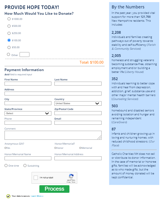
One of the best parts of this donation page is how it reiterates Catholic Charities New Hampshire’s story. The sidebar on the right gives a summary of past accomplishments with direct numbers displaying impact. This shows donors that the organization has been making a genuine difference with the funds raised.

JFK Library: Online Donation Page Example #2
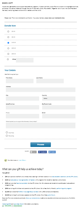
JFK Library not only provides a streamlined process with an embedded online donation form, but also encourages the donor to give by including the impact of certain gift amounts.
This organization includes statements such as “$50 can sponsor one family to witness the swearing in of their loved one in a naturalization ceremony at the JFK Library.” and “$250 can provide free transportation to the JFK Library for 18 underserved students to participate in educational programming.” When reading these specific numbers, donors can better visualize how their gift can make a difference.

DFS Vancouver: Online Donation Page Example #3
DFS Vancouver keeps their donation page simple and easy to fill out. It also includes a small blurb at the top that summarizes what the gift and payment is going toward. They end their donation process with links to share the page via email, Facebook, and Twitter, which is a great way for donors to share their contribution with their own personal networks. This tactic makes social sharing convenient and can help your mission reach new audiences!

Rio Grande Seminary: Online Donation Page Example #4
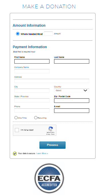
Rio Grande Seminary’s donation page is as simple as it gets. Donors only need to fill in a couple of fields to make an online gift. Plus, the payment process is completely integrated! As soon as you select the ‘One Time’ or ‘Recurring’ gift option, the form expands to ask for your payment information without sending you to a third-party page.

Lovelane: Online Donation Page Example #5
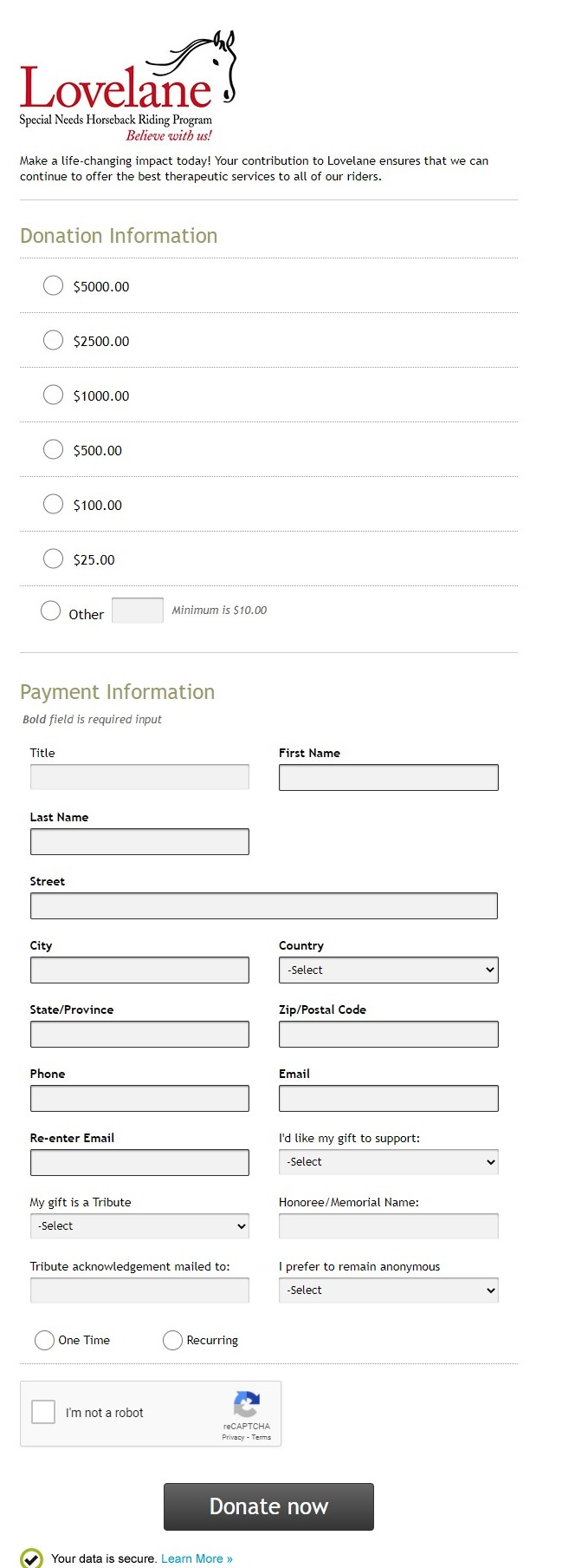
Lovelane’s online donation form is straightforward and eliminates distractions for potential givers. While the donation form is not embedded into the page itself, it is branded to the organization with the logo and slogan at the very top. This lets supporters know that this form is a part of the giving process and that their contributions will in fact be going to the organization. There’s also a short sentence describing what this gift will go toward, further reiterating the organization’s mission and story.
Additional Resources
Want to continue expanding your online fundraising efforts? Optimizing your online donation page may be your first step, but there’s plenty more you can do to enhance your strategy. Explore the following articles and guides to build on your research and make the most of all opportunities for your mission:
- Nonprofit Payment Processing Buyer's Guide for 2020. A bad payment processor puts your donors’ data at risk and can stifle your online fundraising. Review this list of top payment options your nonprofit should look into.
- Donation Forms: An Overview and 7 Templates. The donation form is a key part of your overall online donation page. Learn how to optimize it with this comprehensive guide! You can even explore our 7 donation form templates!